New to The Commerce Lab? This is a 1min insight based on our experiments with 8-and 9-figure brands. Join thousands of brand owners, operators, and marketers 📈 Subscribe here.
No. 105: Hey all,
If you have a product that’s easy to understand through visuals (nail polish, shoes), focus on a fast checkout experience over content on the product page.
One easy way to test this? Move your add-to-cart button.
Here’s where.
In this issue:
This week’s win: Where to place your add-to-cart button on the product page.
In the news: This innovative ecom brand survives on only organic marketing.
Quick tips: How to increase profits by 30% with no ads.
WIN OF THE WEEK
For products that don’t need much nurturing, position your add-to-cart button above product descriptions for a faster checkout.
Your site is a constant balance of commerce and content.
Make it easy to checkout, but provide the right amount of info.
For some products, a low-effort, faster checkout experience with minimal content keeps more buyers in the funnel.
Here’s two real examples:
#1: For a beauty brand, we saw a 9.6% increase in Average Revenue Per User (ARPU) when we moved their add-to-cart button higher up on the product page.

This brand sells nail polish.
It’s an everyday product that people purchase frequently with minimal effort, so a lengthy description is less valuable before checkout. Focus on speed and ease instead.
Good rule of thumb:
If your products need more nurturing (like electronics or supplements), descriptions are much more valued before the next step: add-to-cart.
For products that don’t need much explanation, help keep those ready to buy in the funnel by moving your ATC button above descriptions.
✨ Takeaway: For everyday products, most buyers value the ease of checkout more than the paragraph which describes the item.
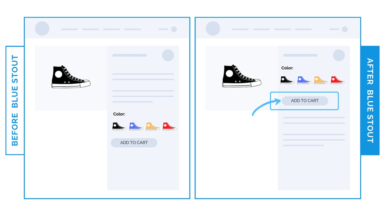
#2: For a high-end footwear brand, conversions (CVR) lifted by 25% when we moved the add-to-cart button higher up on the product page.

Don’t make them scroll to find your call-to-action.
This brand offers color options for their footwear. Before, the product description pushed the color swatches and the add-to-cart button down the page.
Now, with the ATC higher up, more buyers can take action immediately after choosing their color.
✨ Takeaway: For products where visuals do the selling, go for speed and move their next step (add-to-cart) higher up.
Then, as always, test!
🕙 WHAT’S BREWING
Here’s why CRO is the most profitable marketing investment.
📣 IN CASE YOU MISSED IT
Brand-aware buyers value practicality over persuasion.
Increase profits by 30% with no ads.
These 2 upsells added 24% in revenue.
🎯 NEWS
This brand survives on only organic marketing.
👀 LAST WEEK’S LETTER
The 3 changes that led to a footwear brand’s 43% conversion bump sitewide.
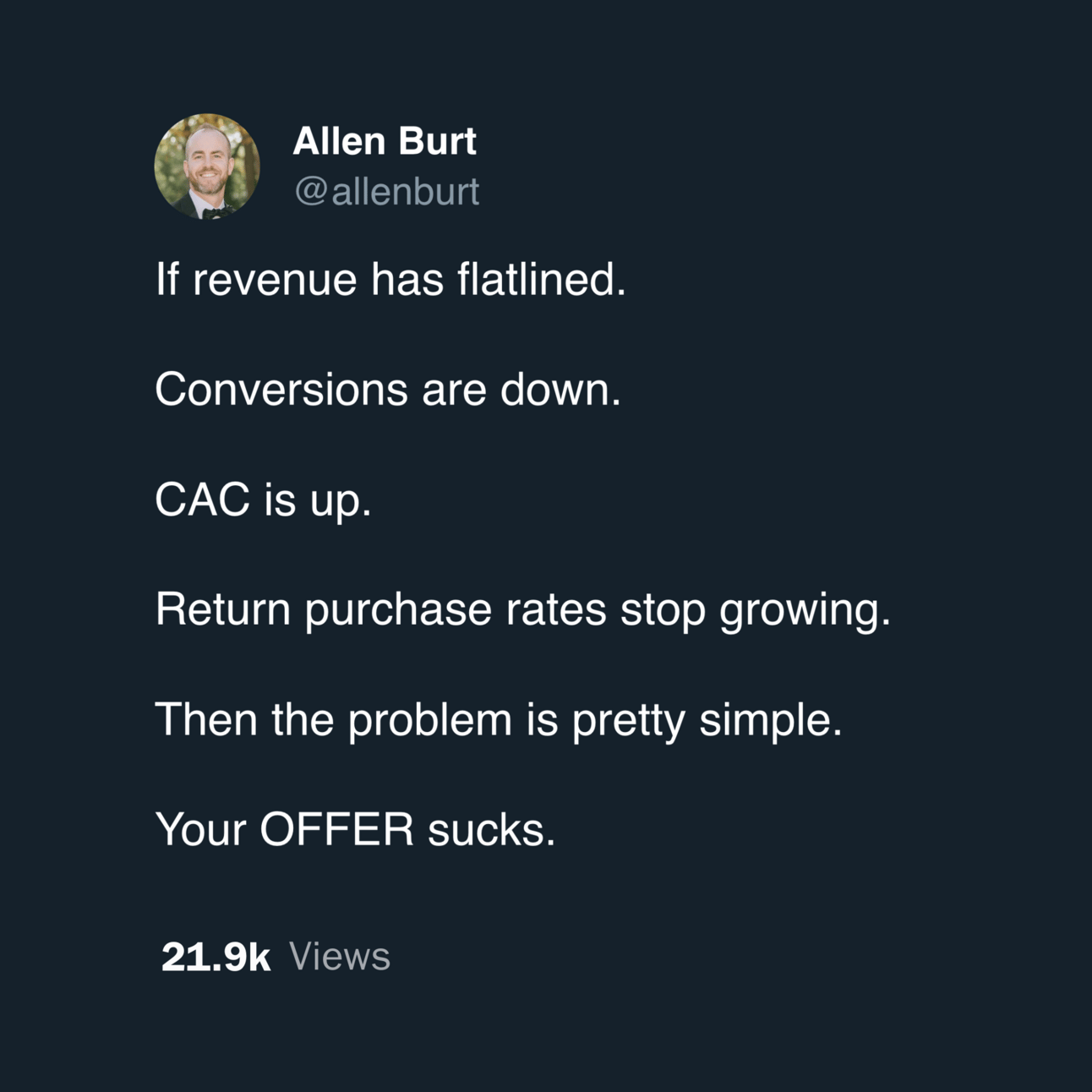
💡 TWEET OF THE WEEK
👊 STOUT SUCCESS

Want this for your store, too?
That's all for today.
If you enjoyed this, please consider forwarding it to a friend, founder, or fellow marketer.
And if you have any comments/questions, I'd love to hear them.
Until next time.
— Allen

Want to work together? Here are 3 ways I can help you:
If you liked this conversion win, see all previous wins here and read our collection of case studies here.
If you want shorter insights daily, follow me on Twitter and LinkedIn.
Want to work with myself and our team? Reply or click here to schedule a call.

