New to The Commerce Lab? This is a 1min insight based on our experiments with 8-and 9-figure brands. Join thousands of brand owners, operators, and marketers 📈 Subscribe here.
No. 106: Hey all,
Badges are the signposts to confident purchases.
They get buyers to the right product faster using urgency, social proof, scarcity, and promotions.
Only one problem: most badges blend in with branding.
Draw attention to your collection page listings using color, price savings, and well-placed text.
Here’s how.
In this issue:
This week’s win: 3 tips to draw attention to products on collections pages.
In the news: How a children’s brand successfully expanded into beauty.
Quick tips: For a $20M brand, a single design mistake could cost you millions.
WIN OF THE WEEK
For large catalogs, draw attention to your products on the collection page with badges, color, and price savings.
#1: We added “Compare at” pricing to a luxury resale brand’s listings. It led to a 16.8% increase in revenue per visitor (and a 4.8% bump in conversions).
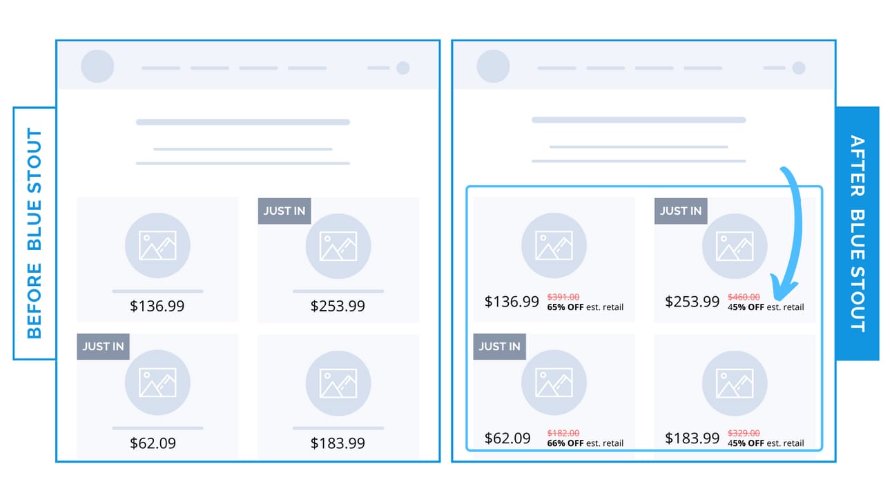
Current pricing as compared to retail shows buyers how much of a deal they’re getting on just-added products.
✨ Takeaway: Drive urgency and communicate value in one quick glance with ‘Compare At’ pricing.
#2: A brightly-colored background on sale badges increased revenue per visitor by 33% and conversions by 12.8% for an apparel brand.

Collections pages allow visitors to scan through your whole catalog at once.
Brightly colored badges draw attention to sale items while eliminating an extra step (clicking to a full sales page).
✨ Takeaway: Appeal to those shopping based on price with a bright background on sale badges. Pick colors that align with the brand BUT don’t blend in.
#3: We added "New" and "Back in Stock" text in color to collections listing for a large-catalog apparel brand. Conversions boosted by 10%.
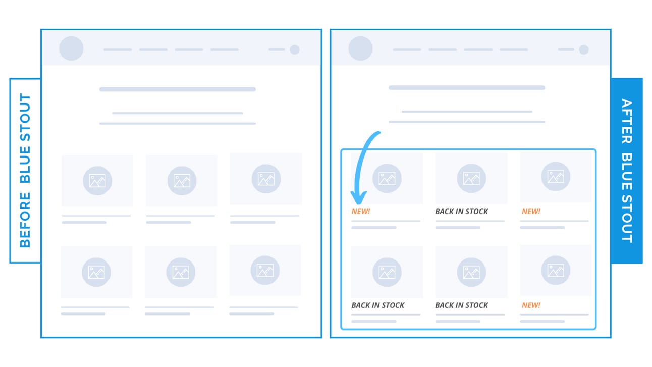
Get buyers to the right product faster with subtle, lightly colored text below your product images.
✨ Takeaway: For large catalogs, narrow down products with color-coded text below images. Minimal space, maximum value.
🕙 WHAT’S BREWING
How an 8-figure apparel brand grew revenue despite a 23% traffic decline.
📣 IN CASE YOU MISSED IT
For a $20M brand, a single design mistake could cost you a million dollars.
Remove this distraction from your homepage.
Double down on data-backed knowledge only you have about your customer.
🎯 NEWS
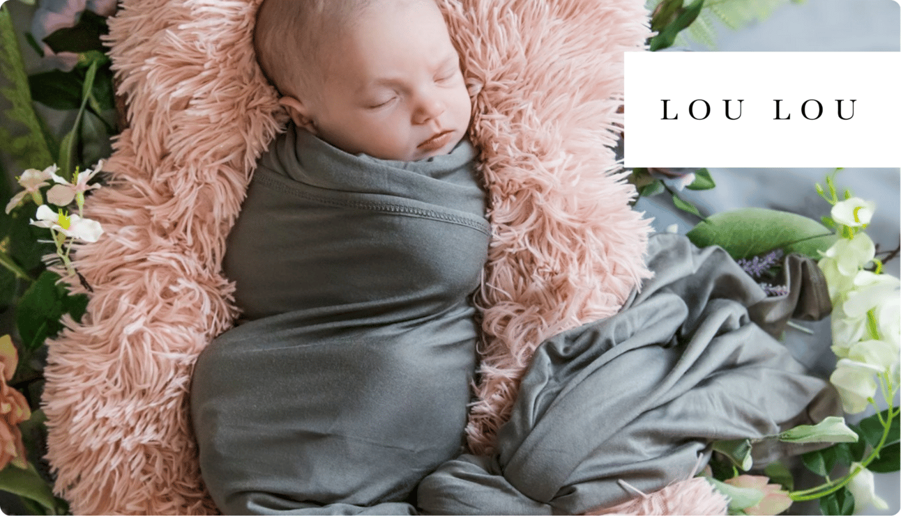
How 20% of a children’s brand’s sales now come from the beauty category.
👀 LAST WEEK’S LETTER
Where to place your add-to-cart button on the product page.
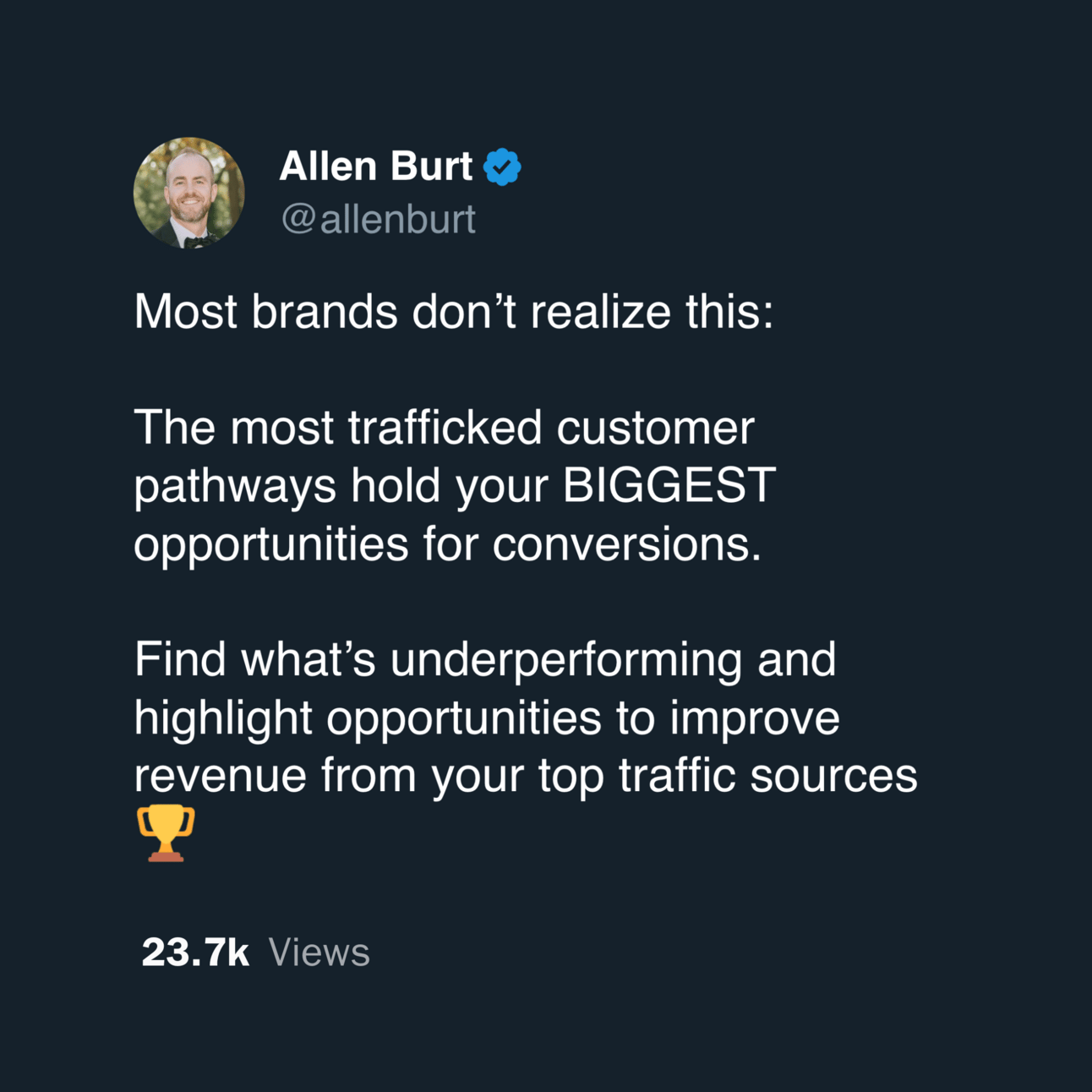
💡 TWEET OF THE WEEK
👊 STOUT SUCCESS
Want this for your store, too?
That's all for today.
If you enjoyed this, please consider forwarding it to a friend, founder, or fellow marketer.
And if you have any comments/questions, I'd love to hear them.
Until next time.
— Allen

Want to work together? Here are 3 ways I can help you:
If you liked this conversion win, see all previous wins here and read our collection of case studies here.
If you want shorter insights daily, follow me on Twitter and LinkedIn.
Want to work with myself and our team? Reply or click here to schedule a call.
