No. 128: Hey all,
Designing a product page is an art and a science.
Today, I’ll show you how to guarantee yours are easy to consume.
Especially if you have a large catalog.
Because no matter how tempting, if you’re using the same 1 or 2 templates across all product types, you could be losing customers.
Here’s how to avoid that.
In less than 1-minute, take away:
An insight to test: The easy-to-miss element adding friction on the product page.
A news highlight: How to thoughtfully promote sales.
Useful tips: How to use tone to increase conversions.
New to The Commerce Lab? This is a 1min insight based on our experiments with 8-and 9-figure brands. Join thousands of brand owners, operators, and marketers 📈 Subscribe here.
🎯 WEEKLY INSIGHT
How removing a color swatch lifted conversions for a fashion brand.
Large catalogs are a lot to manage.
It’s tempting to use one “template” design for all products.
But, what happens when elements intended to help the customer (like color swatches) end up distracting them?
They bounce.
What’s harmless to you could cause a furrowed brow for your buyer.
Avoid unnecessary friction.
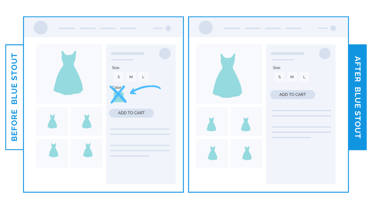
Here’s an example: for an 8-figure fashion brand, we tested removing the color swatch on products that come in just one color.
Conversions lifted by 6.6%.
That’s HUGE for a large brand.
The swatch added noise, complexity, and pushed the ATC button further down.
An image that already existed in the gallery showed the one color available, so there was no need for a color selector.
⭐ Takeaway: As tempting as it is, don’t just use one template for the whole catalog.
When there’s only one color available for a product, remove the swatch and selector to eliminate a decision point for your visitors.
Removing swatches for products available in one color does two things:
Gives visitors less information to process (and fewer decisions to make).
Lifts the add-to-cart button higher on the page (and impulse buys increase).
Action Item: Sift through your product pages. Do your single products have a color swatch? Consider removing it. See what happens.
🕙 WHAT’S BREWING
How this 8-figure fashion brand grew revenue even with a 23% decline in traffic.
📣 IN CASE YOU MISSED IT
How to use tone to increase conversions.
The 3 product badges that lifted revenue per visitor 33%.
🗞️ NEWS HIGHLIGHT
Brands are rethinking when to promote sales.
👀 FROM LAST WEEK
#127: How to write product benefits and where to put them.
💡 ALLEN’S QUICK TIP
👊 STOUT SUCCESS

Curious how we can help you?
What did you think of today's insight?
Want to work together? Here are 3 ways I can help you:
🎯 If you liked this conversion win, see all previous wins here and read our collection of case studies here.
🎓 If you want shorter insights daily, follow me on Twitter and LinkedIn.
📈 Want to work with myself and our team? Reply or click here to schedule a call.
That's all for today.
If you enjoyed this, please consider forwarding it to a friend, founder, or fellow marketer.
And if you have any comments/questions, I'd love to hear them.
Until next time.
— Allen


