Join 21,323 brand owners, operators and marketers. Subscribe here.
No. 149: Hey all,
Even great messaging can hurt conversions if it’s in the wrong spot.
Your product page should lead to one action: buying.
Anything that interrupts this path can hurt conversions.
Here’s how to avoid distractions and boost sales on the product page.
An insight to test: Why you should always test social impact messaging – not just branded content.
Live Training: How to Design Landing Pages
Useful tips: How to present “out-of-stock” items to lift conversions.
But first: quick announcement.
Join us for a special LIVE event next week exclusive to TCL subscribers…
📅 LIVE TRAINING:
The Landing Page Conversion Formula
Do you want to increase your conversion rates from cold traffic using high converting landing pages?
Landing Pages are an essential tool in your toolbox.
But, only if you know how to use them correctly.
That’s why we are going to show you exactly how to design and launch a landing page that’s guaranteed to convert new buyers for your specific product.
Join us LIVE next week on Thursday, April 10th at 9am PT (12pm ET) for a FREE training.
Get ready to learn:
The anatomy of a high-converting landing page.
The exact layout we use for different verticals (CPG, fashion, apparel, beauty, health, etc).
An action-packed teardown of popular brand landing pages.
Then, ask all your questions LIVE with Blue Stout experts.
Can’t make it? No worries. We'll share the recording with all who sign up.
Read time: 2 minutes
🎯 WEEKLY INSIGHT
Good rule of thumb: anything that disrupts the purchase flow has to go.
99% of the time if it’s not essential product info, it will distract customers.
Even the most compelling social impact messaging.
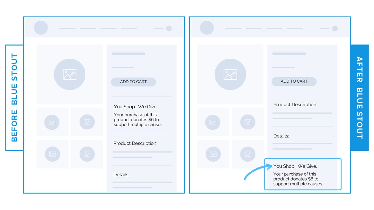
For example: a housewares brand had a charitable giving message above the details and description section on their product page.
While this purpose-driven message sounded great, it distracted from the product specifications in the buy box.
We tested moving it lower on the page and conversions increased by a whopping 20.7%.
Sales information stayed front and center, and the charitable messaging still reinforced brand values.
⭐ Takeaway: Ensure product details are the focal point on the product page, and always test placement of non-essential elements before assuming they’re helping.
Try it out!
🕙 WHAT’S BREWING
How we migrated a 400-year-old brand to Shopify Plus.
📣 IN CASE YOU MISSED IT
How to present “out-of-stock” items to lift conversions.
“Best practices” mean nothing. Use real data instead.
Divert your attention away from this worthless metric.
🗞️ NEWS HIGHLIGHT
How Facebook Marketplace keeps young people engaged.
👀 FROM LAST WEEK
#148: How OSEA increased sales from samples by 84x.
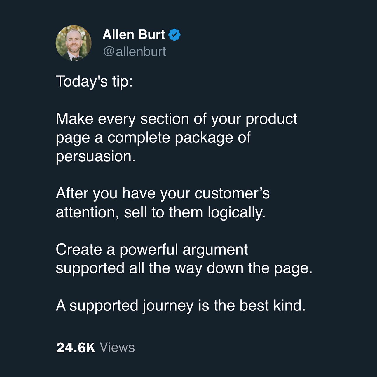
💡 ALLEN’S QUICK TIP
👊 STOUT SUCCESS

Ready to talk shop? Book a strategy call with me.
What did you think of today's insight?
Let’s work together. Here are 3 ways I can help:
🎯 Like this insight? See all previous wins here and collection of case studies here.
🎓 Want super short daily insights? Follow me on Twitter and LinkedIn.
📈 Ready to work together? Get on my calendar here.
That's all for today.
If you enjoyed this, please consider forwarding it to a friend, founder, or fellow marketer.
And if you have any comments/questions, I'd love to hear them.
Until next time.
— Allen


