Join 20,615 brand owners, operators and marketers. Subscribe here.
No. 157: Hey all,
Before we dive in:
Worried things might slow down this summer?
We’ll help you find revenue you’re leaving on the table. No new traffic required.
This week only: 50% off a full site audit for the first 5 TCL readers who book a call. (Must be doing 100k site visitors per month.)
Now, back to today’s insight.
You’ve seen them on nearly every site: the small rotating banner at the top of the page.
They try to do everything.
Highlight promos, share value props, plug the loyalty program...
But most shoppers scroll before the second message loads.
Here’s what to show (and where) to keep shoppers moving.
In less than 2-minutes, take away:
An insight to test: For high-priced products, one page-specific banner message increases clarity and conversions.
A news highlight: Trump warns 150 countries to strike trade deals or face steep tariffs.
Useful tips: Double down on data-backed knowledge. Here’s why.
Read time: 2 minutes
🎯 WEEKLY INSIGHT
When you try to say everything at once, you often say nothing well.
And rotating banners almost guarantee that most of your messages get missed.
Instead:
Give customers a reason to TRUST you on the homepage.
Give them a reason to ACT on your product pages.
Like this:
For a furniture brand, a single, page-specific message outperformed a rotating banner, lifting CVR by 17.7% and AOV by 9.8%.
Here’s what happened:
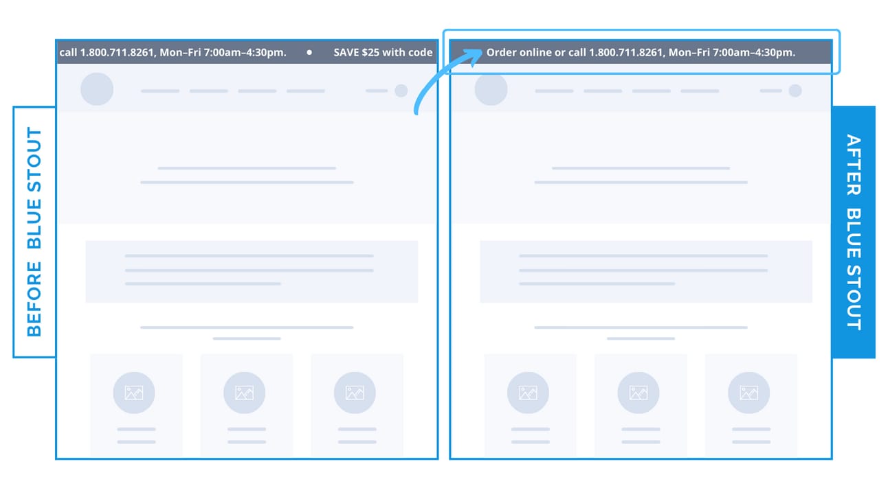
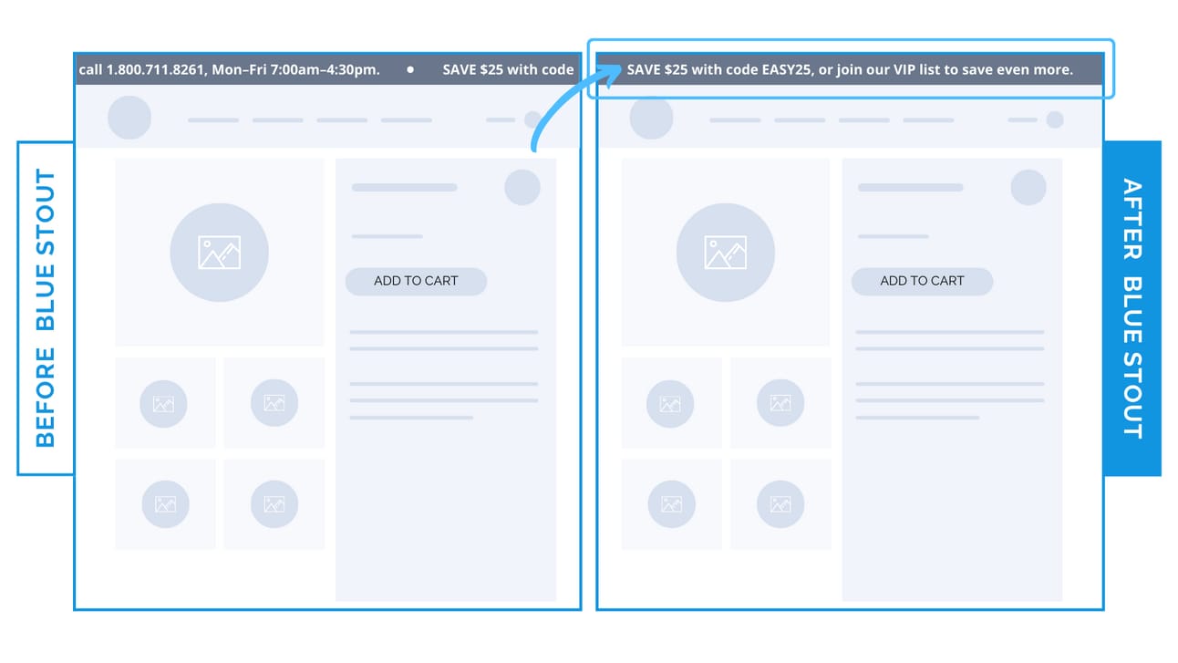
Instead of rotating between brand features and promos, we showed one clear message tailored to the page’s purpose.
On the homepage, it was about giving shoppers flexibility:
“Order online or call 1.800.711.8261, Mon–Fri 7:00am–4:30pm.”
This worked because the brand sells higher-ticket furniture. Visitors appreciate options, like talking to a real person or buying online.
The clarity and confidence helps reduce bounce.
On PDPs and collections, the message switched to a direct incentive:
“SAVE $25 with code EASY25, or join our VIP list to save even more.”
At the point of purchase, urgency and savings are the move.
This targeted message gave users a reason to act, and rewarded them for it.
If your product requires more consideration, skip the rotating carousel.
Give visitors one strong, relevant message based on where they are in their journey.
⭐ Takeaway: Replace your rotating banners with one clear, purpose-driven message tailored to the page. One good message in the right spot beats five that never land.
🕙 WHAT’S BREWING
Missed our live training? Here’s how to raise prices without hurting conversions.
📣 IN CASE YOU MISSED IT
Save the pricing conversation for your product page. Here’s why.
Remove this distraction from your homepage.
Double down on data-backed knowledge only YOU have about your customer.
🗞️ NEWS HIGHLIGHT
Trump warns 150 countries to strike trade deals or face steep tariffs.
👀 FROM LAST WEEK
#156: What most brands get wrong about collection pages.
💡 ALLEN’S QUICK TIP
👊 STOUT SUCCESS

Ready to talk shop? Book a strategy call with me.
Was today's insight valuable?
Let’s work together. Here are 3 ways I can help:
🎯 Like this insight? See all previous wins here and collection of case studies here.
🎓 Want super short daily insights? Follow me on Twitter and LinkedIn.
📈 Ready to work together? Get on my calendar here.
That's all for today.
If you enjoyed this, please consider forwarding it to a friend, founder, or fellow marketer.
And if you have any comments/questions, I'd love to hear them.
Until next time.
— Allen


