Join 20,001 brand owners, operators and marketers. Subscribe here.
No. 166: Hey all,
Before we get started, tomorrow I’ll be LIVE showing you how to turn mobile visitors into buyers.
We'll give you the exact layouts, designs, and messaging strategies that convert mobile site visitors — especially those coming from paid social ads.
Back to today’s takeaway…
What’s one of the fastest ways to lose a sale?
Slowing down a shopper who is ready to buy.
We see it all the time on mobile product pages.
Brands put long blocks of copy above the price and buttons, slowing down high-intent shoppers.
If you sell simple CPG or replenishable products, not everyone needs convincing.
Some people just want to buy fast.
Here’s how to help those buyers act quickly without hurting the rest.
In under 2 minutes, take away:
An insight to test: The mobile change that increased revenue per visitor by 5.8%.
A news highlight: Why JanSport revived its cringeworthy ads to reach Gen Z.
Useful tips: Price bundles for higher conversions.
Read time: 2 minutes
📅 LIVE TOMORROW:
The Mobile Conversion Formula: How to Turn Mobile Visitors into Buyers
We'll show you the exact layouts, designs, and messaging strategies that convert mobile visitors into buyers—especially those coming from paid social ads.
You’ll Learn:
The conversion-optimized mobile layouts that turn browsers into buyers
Proven design changes that boost mobile PDP conversion rates by double digits
Advanced retargeting strategies to capture visitors who aren't ready to buy yet
Real case studies from CPG, apparel, luxury, health, and beauty brands
Live teardowns of top-performing mobile sites in your industry
🎯 WEEKLY INSIGHT
Sell a product people buy more than once? Don’t make them scroll to checkout on mobile.
If someone already knows your brand and just wants to reorder, don’t slow them down with a wall of copy.
We tested this on a supplement brand’s mobile product page:
Instead of keeping the full product description and supplement facts up top, we moved them into expandable sections below the Add to Cart button.
The essentials (price, Subscribe & Save, Add to Cart) were right where they needed to be, helping ready-to-buy shoppers check out faster.
The result: A 5.8% lift in revenue-per-visitor.
For simple or repeat-purchase products, that’s key: some shoppers don’t need helpful information. They just want to order.
Instead of stacking long descriptions up top, we moved them into collapsible sections below the CTA so that:
Ready-to-buy shoppers can check out quickly
New visitors can scroll and explore more when they’re ready
⭐ Takeaway: Collapse long content and keep purchase options up top to speed up conversions for repeat or familiar products.
🕙 WHAT’S BREWING
How Rishi Tea turned a flat site redesign into $1.8M of added revenue.
📣 IN CASE YOU MISSED IT
Price bundles for higher conversions.
Experiment with optimizing based on your REAL data.
3 design best practices to let go of.
🗞️ NEWS HIGHLIGHT
Why JanSport revived its cringeworthy ads to reach Gen Z.
👀 FROM LAST WEEK
#165: Is your homepage saying the right things in the wrong order?
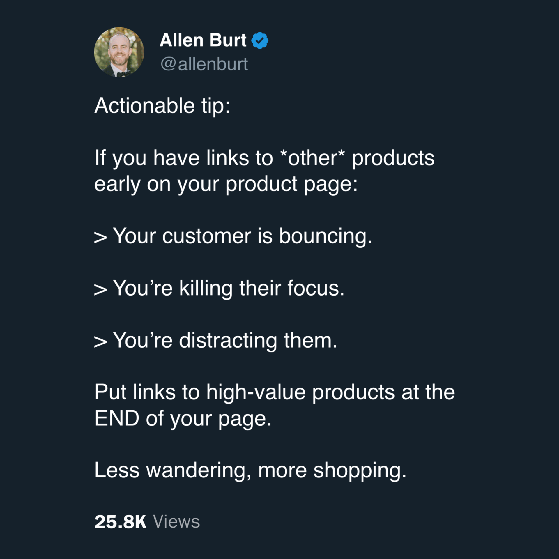
💡 ALLEN’S QUICK TIP
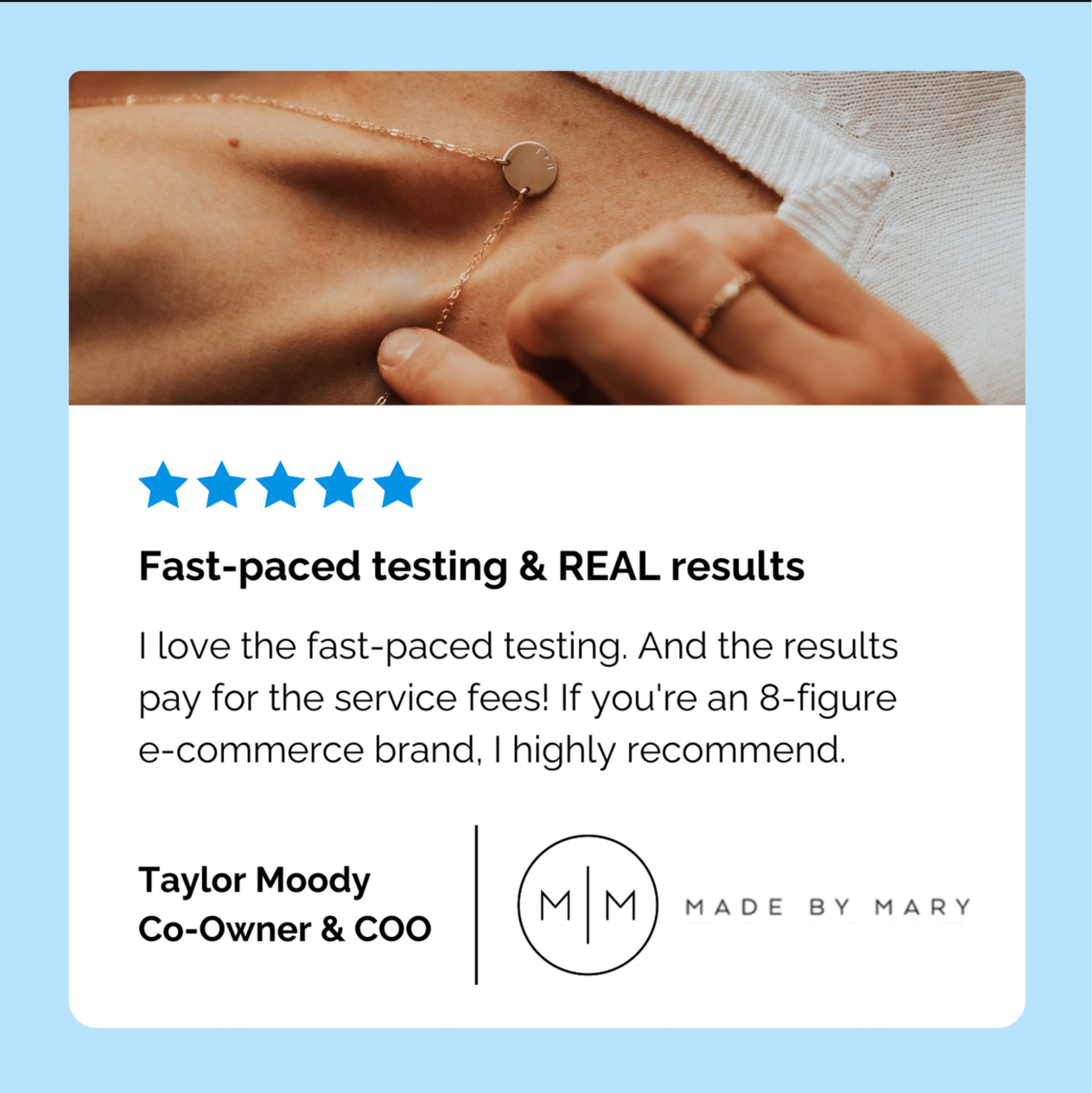
👊 STOUT SUCCESS

Ready to talk shop? Book a strategy call with me.
Was today's insight valuable?
Let’s work together. Here are 3 ways I can help:
🎯 Like this insight? See all previous wins here and collection of case studies here.
🎓 Want super short daily insights? Follow me on Twitter and LinkedIn.
📈 Ready to work together? Get on my calendar here.
That's all for today.
If you enjoyed this, please consider forwarding it to a friend, founder, or fellow marketer.
And if you have any comments/questions, I'd love to hear them.
Until next time.
— Allen


