Join 30k+ brand owners, operators and marketers. Subscribe here.
No. 174: Hey all,
Most reviews never get read.
Not because customers don’t care. Brands just put them where they think they should.
But social proof is most effective where decisions are made.
So we ran experiments across industries (apparel, supplements, home, and beauty) to test reviews in spots most brands overlook.
The results: lifts as high as 40%.
Here’s what worked.
In less than 3 minutes, take away:
An insight to test: How to align customer reviews with hesitation points.
A news highlight: Nike’s ‘Why do it?’ campaign has a Gen Z twist.
Useful tips: Why you should add tutorials to collections pages.
Read time: 2.5 minutes
🎯 WEEKLY INSIGHT
Reviews work best where decisions are made.
Not buried in the product page, but placed where hesitation is highest.
That’s where reviews remove doubt, build trust, answer questions, and validate the next step.
Here are 4 spots worth testing on your site.
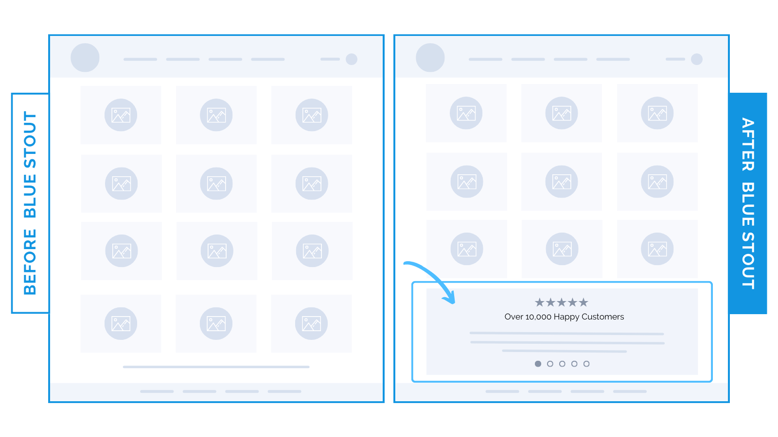
1) At the bottom of the collection page
For this apparel brand with a broad catalog, shoppers who reached the bottom of collections often bounced.
To keep their attention, we added reviews after the last row of products.
Instead of exiting, shoppers looped back up to keep browsing high-value products.
Result: More products viewed and more carts filled.
👉 Lesson: Reviews can nudge buyers to keep exploring when interest dips.
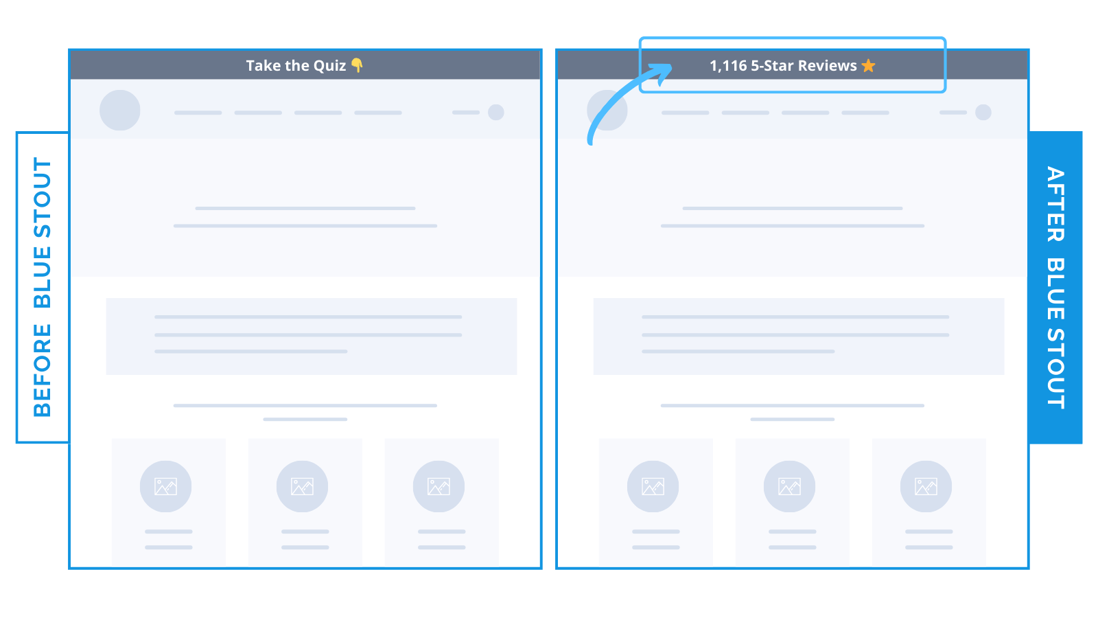
For a beauty brand, the top of the site had a bar that said: “Take the quiz.”
We swapped it for: “1,116 5-Star Reviews.”
Result: 26.8% lift in conversions.
Why? Because trust beats tasks. The proof of happy customers landed harder than another step.
👉 Lesson: First impressions set the tone. Don’t give them a chore, lead with credibility.
3) Near the top of the homepage
For a nutrition brand selling supplements, we wanted to address customer hesitation early (key for higher-priced brands).
So we pulled detailed reviews to the top. They were originally buried down the page, likely to reduce clutter.
Moving them higher drove a 13.7% lift in conversions.
Sometimes your best sales pitch is a review.
👉 Lesson: Reviews work hardest when they meet hesitation head-on.
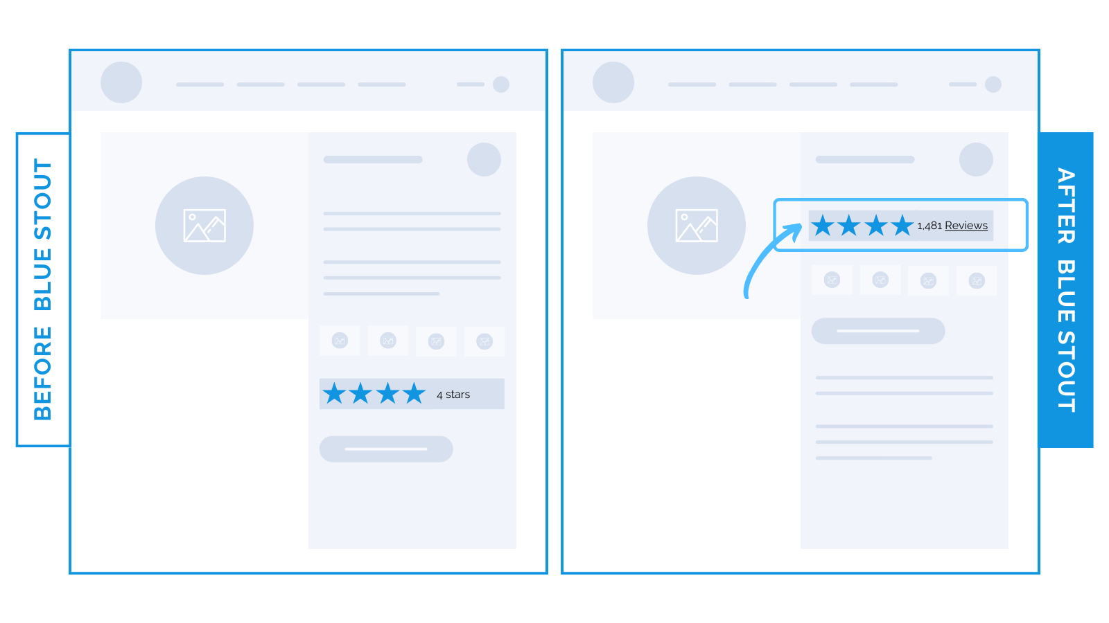
For an 8-figure apparel brand, we knew that hesitation spikes right before Add-to-Cart.
To lower objections, we dropped clickable reviews right under the product name.
Result? Conversions lifted 40%.
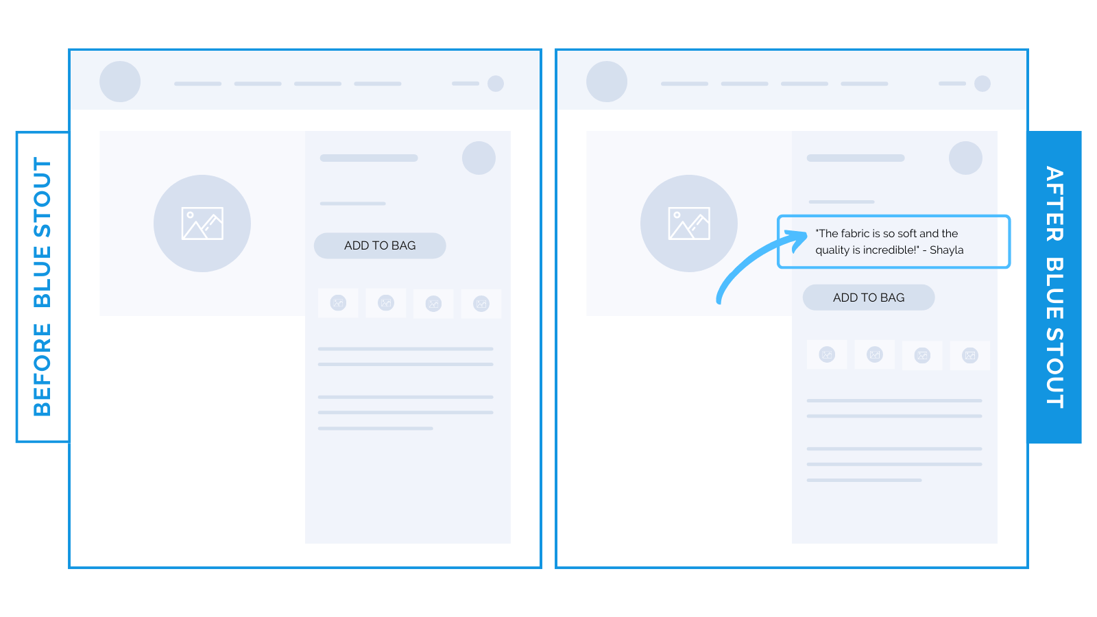
Then, for a home goods brand, we swapped stars for a real testimonial.
Above the Add-to-Cart button, that one change lifted conversions 11%.
Different format, same win: proof kills doubt when it sits at the moment of choice.
⭐ Takeaway: The closer reviews sit to the decision, the harder they work. Place them where hesitation is highest to see your conversions jump.
Try it out!
🕙 WHAT’S BREWING
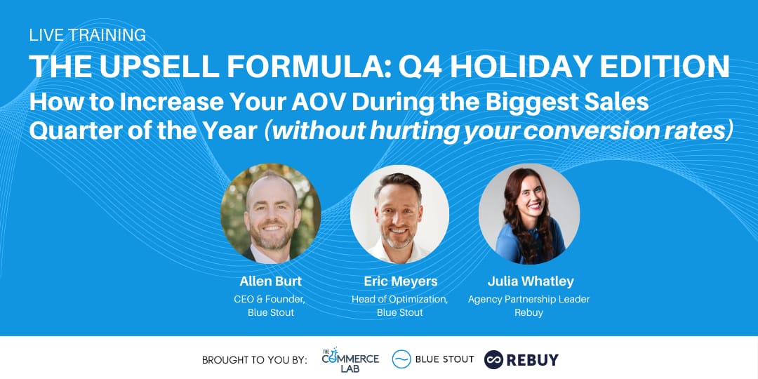
How to increase AOV during the biggest sales quarter of the year.
📣 IN CASE YOU MISSED IT
“What size do I need!?” Use this trick to help customers choose.
Maximize sales with your add-to-cart button
Why you should add tutorials to collections pages.
🗞️ NEWS HIGHLIGHT
Nike’s ‘Why do it?’ campaign has a Gen Z twist.
👀 FROM LAST WEEK
#173: 4 layout fixes that lifted conversions up to 15%.
💡 ALLEN’S QUICK TIP
👊 STOUT SUCCESS

Ready to talk shop? Book a strategy call with me.
Was today's insight valuable?
Let’s work together. Here are 3 ways I can help:
🎯 Like this insight? See all previous wins here and collection of case studies here.
🎓 Want super short daily insights? Follow me on Twitter and LinkedIn.
📈 Ready to work together? Get on my calendar here.
That's all for today.
If you enjoyed this, please consider forwarding it to a friend, founder, or fellow marketer.
And if you have any comments/questions, I'd love to hear them.
Until next time.
— Allen
