Join 30,000+ brand owners, operators and marketers. Subscribe here.
No. 183: Hey all,
Your fastest buyers start with search.
Hide the search bar, and you’re adding friction to the people most likely to convert.
If you sell a big catalog and your shoppers arrive with intent, a tiny magnifying glass isn’t enough (and often overlooked).
In a recent test for a craft retailer, we moved search out of navigation and into the header.
Here’s what happened.
In less than 2 minutes, learn:
Read time: 2 minutes
Need to boost conversion rates and revenue in Q1?
Meet with our expert team and get a free storefront analysis. We'll show you exactly what to change to increase conversions and profit.
🎯 WEEKLY INSIGHT
A hidden search bar forces ready buyers to dig through menus. A visible one removes friction and sends them straight to the product.
For a craft retailer with a large catalog, 6.7% of visitors were using the site search.
One extra click doesn’t sound like much. But when lots of visitors are ready to type in what they want, that small friction adds up.
Most search bars exist behind a magnifying glass icon, which forces buyers to take an extra step.
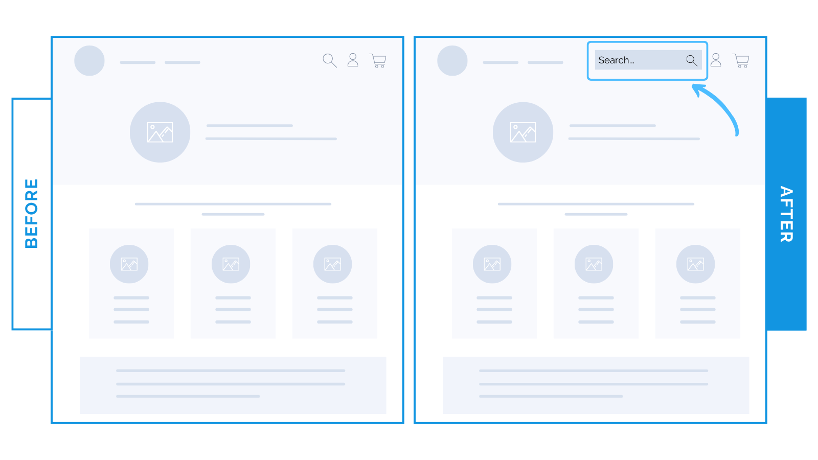
Instead, we ran a test making the search field visible by default on desktop.
The result: +10% lift in conversion rate.
The visible search in the header:
Made it feel easier and faster to find specific products
Allowed browsing shoppers to skip straight to what they wanted
Helped the “I know what I want” buyer not to slow down or be distracted
When you understand how your customers shop, small layout fixes go a long way.
As always, test!
⭐ Takeaway: Remove the extra step by making search visible in your header so shoppers can buy faster.
🕙 WHAT’S BREWING
By fixing conversion friction before scaling traffic.
Early wins: high-leverage A/B tests that clarified the path to purchase and cut steps.
Prioritize what shoppers need to decide faster, not just more features.
🗞️ NEWS HIGHLIGHT
Merchants can sell directly within ChatGPT through a new "Instant Checkout" feature.
Glossier, SPANX, and SKIMS are the first to launch (with many coming soon).
New sales channel, shorter purchase journey, and more personalized product matching
👀 FROM LAST WEEK
Three focused changes (cleaner collections, tighter PDPs, and a tested upsell removal).
The strategy: clear the path, cut noise, and keep only the revenue-positive elements.
No best practices. The only way to know what works is to test.
If small changes like this can lift conversions double digits, imagine what a full-site strategy could do.
Let’s find your next win → Book a strategy call.
Until next time,
— Allen


