Join 30,000+ brand owners, operators and marketers. Subscribe here.
No. 185: Hey all,
For premium CPG brands, the story is what earns the sale – but only if shoppers actually see it.
On one product page, 25% of visitors never reached the details that justify the price.
So we redesigned the flow to bring that story into their path.
Here’s what changed when shoppers finally saw it.
In less than 3 minutes, learn:
Read time: 2.25 minutes
But one important thing before we dive in…
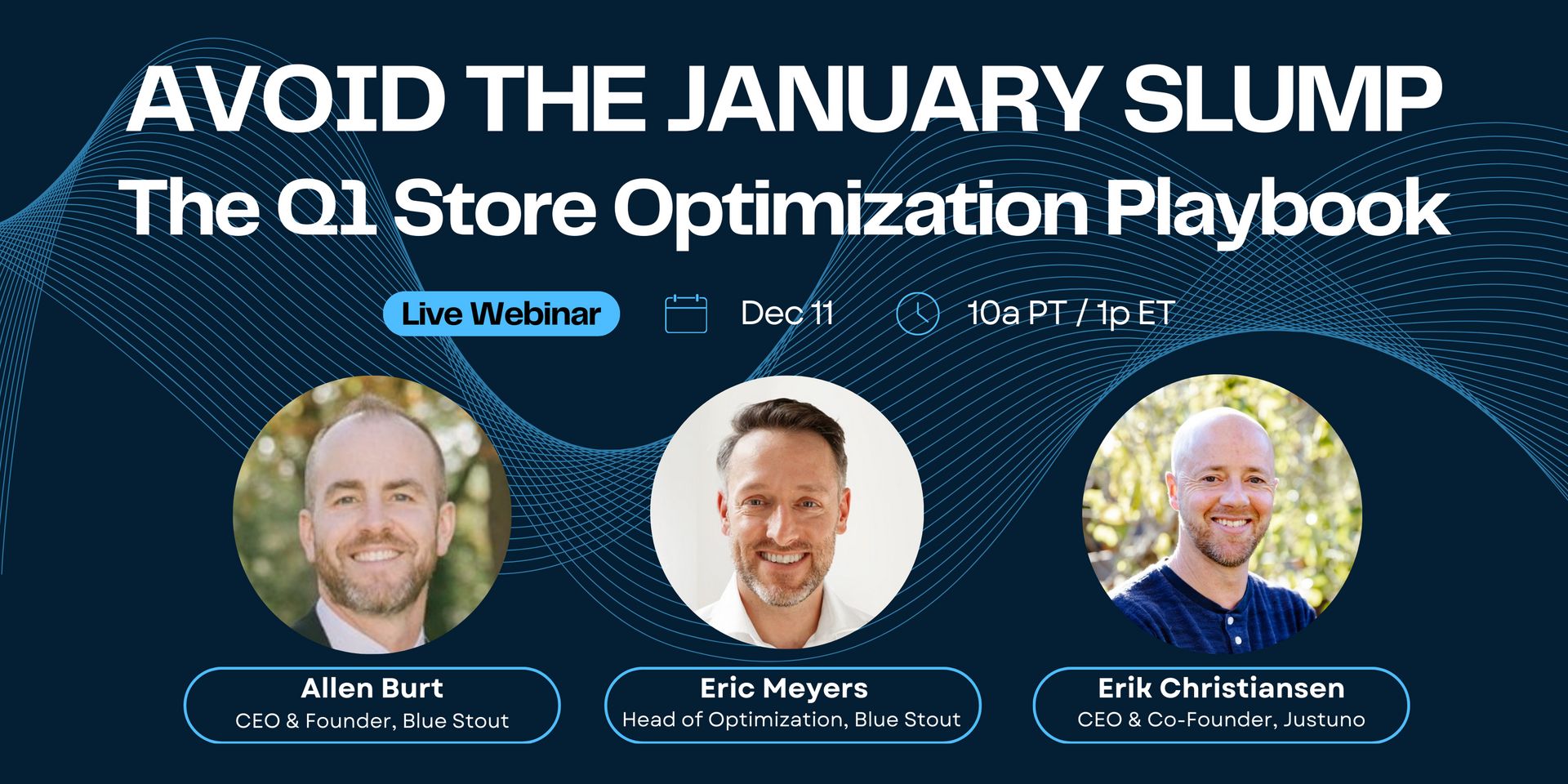
📅 LIVE TRAINING
Get Your Store Optimized for 2026
Join us tomorrow, Dec 11 at 10 AM PT / 1 PM ET for a FREE live session with Blue Stout.
January doesn't have to be brutal.
While most ecommerce brands brace for the post-holiday crash—watching traffic and revenue plummet after their big December—elite operators are doing something different.
Join us for a live training where we'll share proven optimizations to boost Q1 revenue.
In this session, we’ll show you:
The 5 highest-impact Q1 store optimizations ranked by test results—plus how to transition from holiday mode without killing conversions
A counter-intuitive homepage change that helped an apparel brand maintain 47% higher January conversions year-over-year
Vertical-specific tactics and personalization strategies to re-engage holiday browsers, with live Q&A on your store
The brands that win Q1 are the ones that optimize now—before January hits.
Can't make it? Sign up anyway and we'll send the replay.
🎯 WEEKLY INSIGHT
If the story sells the product, shoppers need to see it early – before they decide.
For premium CPG brands (tea, coffee, supplements) the value proposition is the origin, sourcing, and preparation details.
That’s what justifies the price.
But on one tea brand’s PDP, 25% of desktop visitors never reached that content.
Shoppers were evaluating the product without ever seeing the information that would sell it.
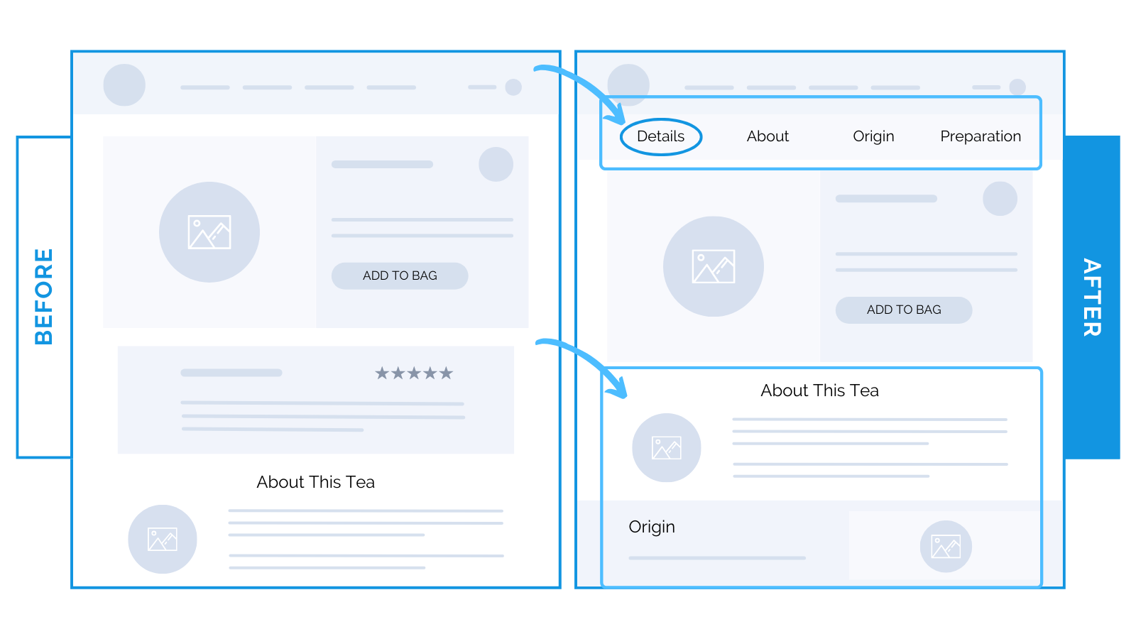
We moved the “Details / About / Origin / Preparation” sections higher on the page and added a floating Table of Contents that appears as soon as the user starts scrolling.
Two goals:
Make the story unavoidable.
Make long-form content easy to navigate.
This repositioning led to a 19% lift in conversions.
The floating TOC bar gave them a clear roadmap through a long product page.
This reduced the chance of missing key info (and increased the likelihood of committing).
Shoppers reached the educational content earlier, understood what made the tea worth the price, and moved forward with more confidence.
⭐ Takeaway: If your story is what sells the product, it needs to be seen before shoppers decide whether it’s worth the price. Make it impossible to miss with a well-timed Table of Contents for higher conversions.
Need to boost conversion rates and revenue in Q1?
Meet with our expert team and get a free storefront analysis. We'll show you exactly what to change to increase conversions and profit.
🕙 WHAT’S BREWING
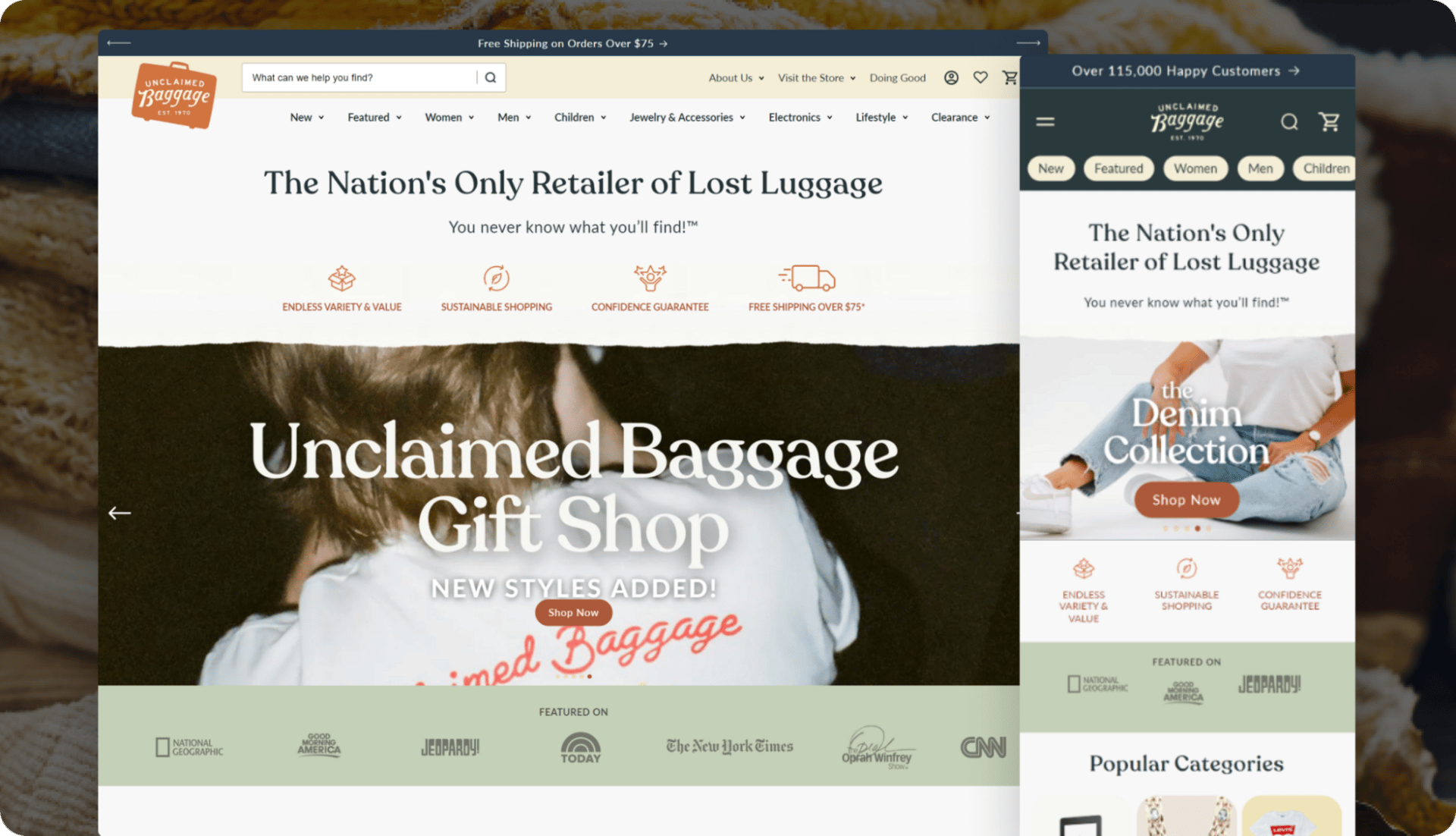
A clearer homepage and nav made it easier for shoppers to navigate a massive catalog.
The product page helped visitors understand condition, pricing, and value faster.
Cleaner filters and layouts reduced friction and lifted conversions.
🗞️ NEWS HIGHLIGHT
Shopify will use Liquid AI’s foundation models to power search and other features.
They’re building a new recommender system that’s outperforming previous versions.
The first rollout is a search model that delivers results in under 20ms.
👀 FROM LAST WEEK
Repositioning products around first-time visitor needs increased lifted conversion.
Updated messaging and hierarchy helped shoppers understand benefits faster.
A simplified PDP flow improved decision-making for new customers.
If small changes like this can lift conversions double digits, imagine what a full-site strategy could do.
Let’s find your next win → Book a strategy call.
Until next time,
— Allen
